1. ホーム
  2. CSS
  3. 【CSS】Flexboxを使いこなす - その1 基本と Flex コンテナ(親要素)のプロパティ

【CSS】Flexboxを使いこなす – その1 基本と Flex コンテナ(親要素)のプロパティ

並列、縦列レイアウトの切り替えがシンプルなコードで行える Flexbox が使いこなせると、レスポンシブデザインが簡単にできますね。サンプル用のウェブページも作ってみました。ソースと合わせて動きを見てもらえればと思います。
プロパティがかなり多いので、今回は以下の3点をまとめます。

Flexbox とは

Flexコンテナ(親要素)の中に、いくつかの Flexアイテム(子要素)を内包する構成です。
Flexコンテナ内でのFlexアイテムの配置、伸縮などを指定することができます。

↓ の HTML において、クラス item の6つの要素の配置、サイズを、順々にCSS Flexbox を利用して指定していきます。

HTML

<div class="flex-container">
   <div class="item one">1番目の要素</div>
   <div class="item two">2番目の要素</div>
   <div class="item three">3番目の要素</div>
   <div class="item four">4番目の要素</div>
   <div class="item five">5番目の要素</div>
   <div class="item six">6番目の要素</div>
</div>

Flexboxの基本の記述

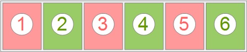
CSSに「desplay: flex」と指示することで、要素が並列になります。

CSS

.flex-container {
	display: flex;
}

対応していないブラウザもあるかもしれないので、プレフィックスのも記述した方がいいでしょう。(以後、全て、プレフィックスも記します。)

.flex-container {
	display: -webkit-box;
	display: -ms-flexbox;
	display: flex;
}

サンプルページ: flex-01.html

flex-directionプロパティ(方向の指定)

flex-directionを使うと、HTMLはそのままで、Flexコンテナの主軸の方向を設定することができます。

(デフォルト flex-direction: row

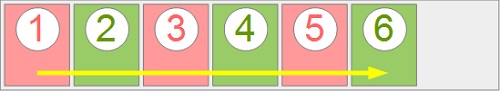
flex-direction: row(並列 左から右へ)

.flex-container {
	display: -webkit-box;
	display: -ms-flexbox;
	display: flex;

	-webkit-box-orient: horizontal;
	-webkit-box-direction: normal;
	-ms-flex-direction: row;
	flex-direction: row;
}

サンプルページ: flex-direction-row.html

flex-direction: row-reverse(並列 右から左へ)

.flex-container {
	display: -webkit-box;
	display: -ms-flexbox;
	display: flex;

	-webkit-box-orient: horizontal;
	-webkit-box-direction: reverse;
	-ms-flex-direction: row-reverse;
	flex-direction: row-reverse;
}

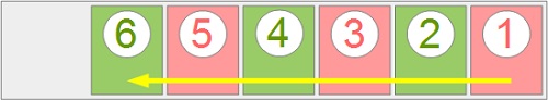
サンプルページ: flex-direction-row-reverse.html

flex-direction: column(縦列 上から下へ)

.flex-container {
	display: -webkit-box;
	display: -ms-flexbox;
	display: flex;

	-webkit-box-orient: vertical;
	-webkit-box-direction: normal;
	-ms-flex-direction: column;
	flex-direction: column;
}

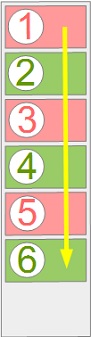
サンプルページ: flex-direction-column.html

flex-direction: column-reverse(縦列 下から上へ)

.flex-container {
	display: -webkit-box;
	display: -ms-flexbox;
	display: flex;

	-webkit-box-orient: vertical;
	-webkit-box-direction: reverse;
	-ms-flex-direction: column-reverse;
	flex-direction: column-reverse;
}

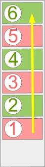
サンプルページ: flex-direction-column-reverse.html

flex-wrapプロパティ(改行可否の指定)

縮小して1行に収めるか、幅を超えたら改行するかを指定できます。

デフォルト flex-wrap: nowrap

flex-wrap: nowrap(縮小して1行に収める)

.flex-container {
	display: -webkit-box;
	display: -ms-flexbox;
	display: flex;

	-ms-flex-wrap: nowrap;
	flex-wrap: nowrap;
}

サンプルページ: flex-wrap-nowrap.html

flex-wrap: wrap(縮小しないで複数行に配置 左から右へ 上から下へ)

.flex-container {
	display: -webkit-box;
	display: -ms-flexbox;
	display: flex;

	-ms-flex-wrap: wrap;
	flex-wrap: wrap;
}

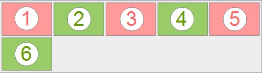
サンプルページ: flex-wrap-wrap.html

flex-wrap: wrap-reverse(縮小しないで複数行に配置 左から右へ 下から上へ)

.flex-container {
	display: -webkit-box;
	display: -ms-flexbox;
	display: flex;

	-ms-flex-wrap: wrap-reverse;
	flex-wrap: wrap-reverse;
}

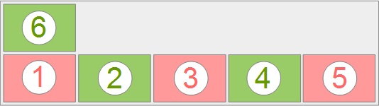
サンプルページ: flex-wrap-wrap-reverse.html

flex-flowプロパティ(flex-direction, flex-wrapをまとめて指定するショートハンド)

デフォルト flex-flow: row nowrap

.flex-container {
	display: -webkit-box;
	display: -ms-flexbox;
	display: flex;

	-webkit-box-orient: horizontal;
	-webkit-box-direction: normal;
	-ms-flex-flow: row nowrap;
	flex-flow: row nowrap;
}

「flex-flow:」に続けて、スペースを開けて、「flex-direction」「flex-wrap」の順に指定します。

サンプルページ: flex-flow.html

ここまで!続きは・・・

⇒ CSS Flexboxを使いこなす – その2

⇒ CSS Flexboxを使いこなす – その3

カテゴリーCSS